When potential customers are shopping for new landscaping ideas and installers, they like to see a gallery page with different ideas and past projects. However, this page can actually bring a lot of SEO value to your website as well, if done properly.
In order to maximize the value of your landscaping gallery page, you need to follow these 5 simple steps when setting it up.
What is Gallery Image SEO?
SEO, or Search Engine Optimization, is the practice of structuring your website in a way Google Prefers. This includes how you format your gallery images.
In order to maximize the value of your gallery page, we need to make sure that Google, and other search engines, know how and why to show your page.
We tell Google through a practice called “Search engine optimization”. This process is both technical and artistic, and can be frustrating when it doesn’t work perfectly.
By following the steps below, we are improving our opportunities to be showing a search result for the images on this gallery page. Then, more customers will see our fine work and requests quotes and then purchase!
1. High Quality Photos
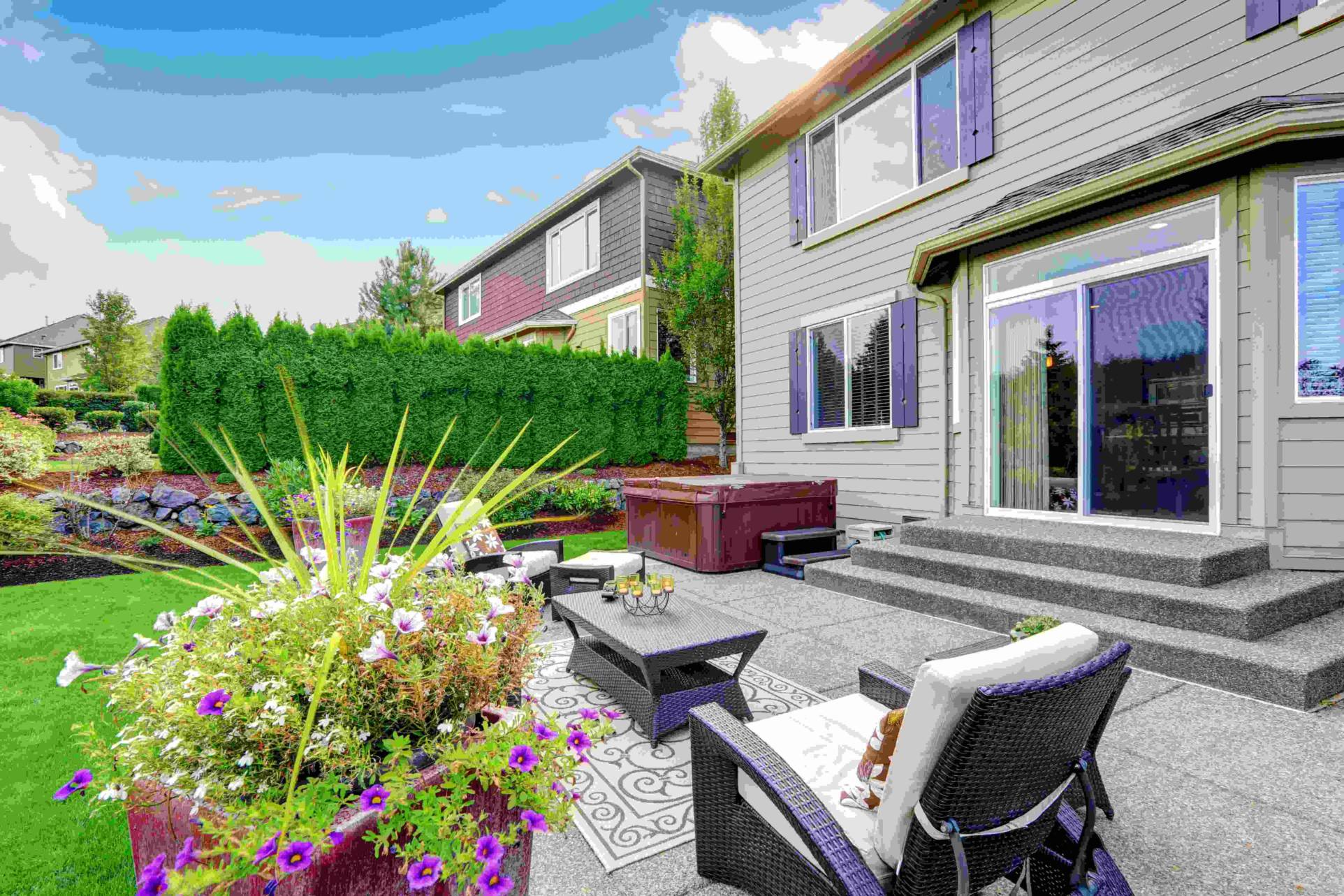
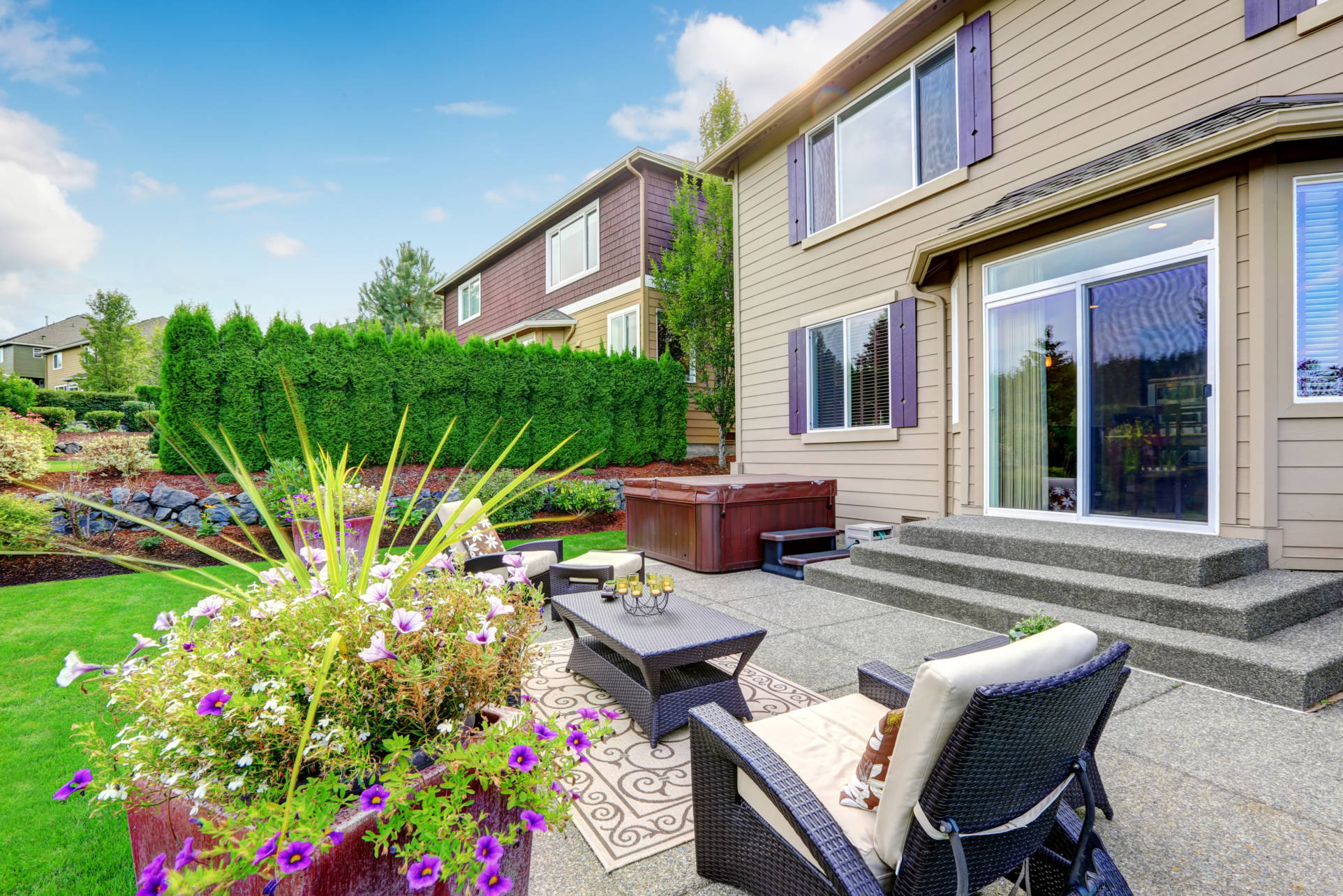
Ensuring that you have beautiful, high resolution photos for your gallery is crucial.
When people are viewing your gallery, they need to be impressed. Nowadays, everyone has a high quality camera in their pocket. This makes low quality images a massive deal breaker.
We highly recommend purchasing a drone for high quality aerial landscape photography. It is extremely easy to take amazing shots with even a basic drone. We recommend this one to start.
Once you have the photos, they need some touch up work. Having a photo editor color correct or enhance your images really goes a long way, considering that your competition is doing the same.


2. Compressed For Web
Loading your images fast keeps customers on your site and Google happy.
Now that you have your high quality photos of your past projects, you are ready to upload them to your website. However, they might not be ready for the internet.
Historically, we have desired images with high “bit-depth”. This means that there is a lot of data in the actual image file, kind of like a long vs short movie file. The internet doesn’t like large files. It likes tiny files. The smaller, the better.
Image compression allows us to take extra data out of the image without losing tons of quality. There are lots of image compression sites out there, but this is one that we feel does a good job.
The reason we need these tiny images is for load speed. the faster a webpage can download and load, the more likely people will view it. Many people abandon pages in just 2 seconds! Plus, Google is watching your load speed too, so fast is best.
3. Descriptive File Names
Your file names tell Google what the image is about.
Before you upload your compressed, edited image to your website, it is going to need a name. That name is critical to how the image is handled by google.
When you name the image, Google is going to assume that the content is whatever the name is. This means we can nudge Google in the direction we want by naming files after great search terms. Some of these search terms are:
- Landscaper Near Me
- [NAME OF YOUR CITY] Landscaper
- Patio Installation
- Gazebo Contractor
- Lawn Maintenance Professional
- Outdoor Kitchen
- Landscape Designs
So, before you upload, name those files as good and descriptively as you can. You can even use hyphens to add extras or additional concepts, such as landscape-hardscape-design.jpg!
4. Lightbox Enabled
Give your images the up close treatment by using lightboxes.
Now we have beautiful, compressed images with web friendly names. It is time to put them on the website. If you don’t have a website, message us here and we can get one started for you within 2 weeks.
When you put them on the website (depending on how your website is setup), you will want to enable lightboxes for your gallery.
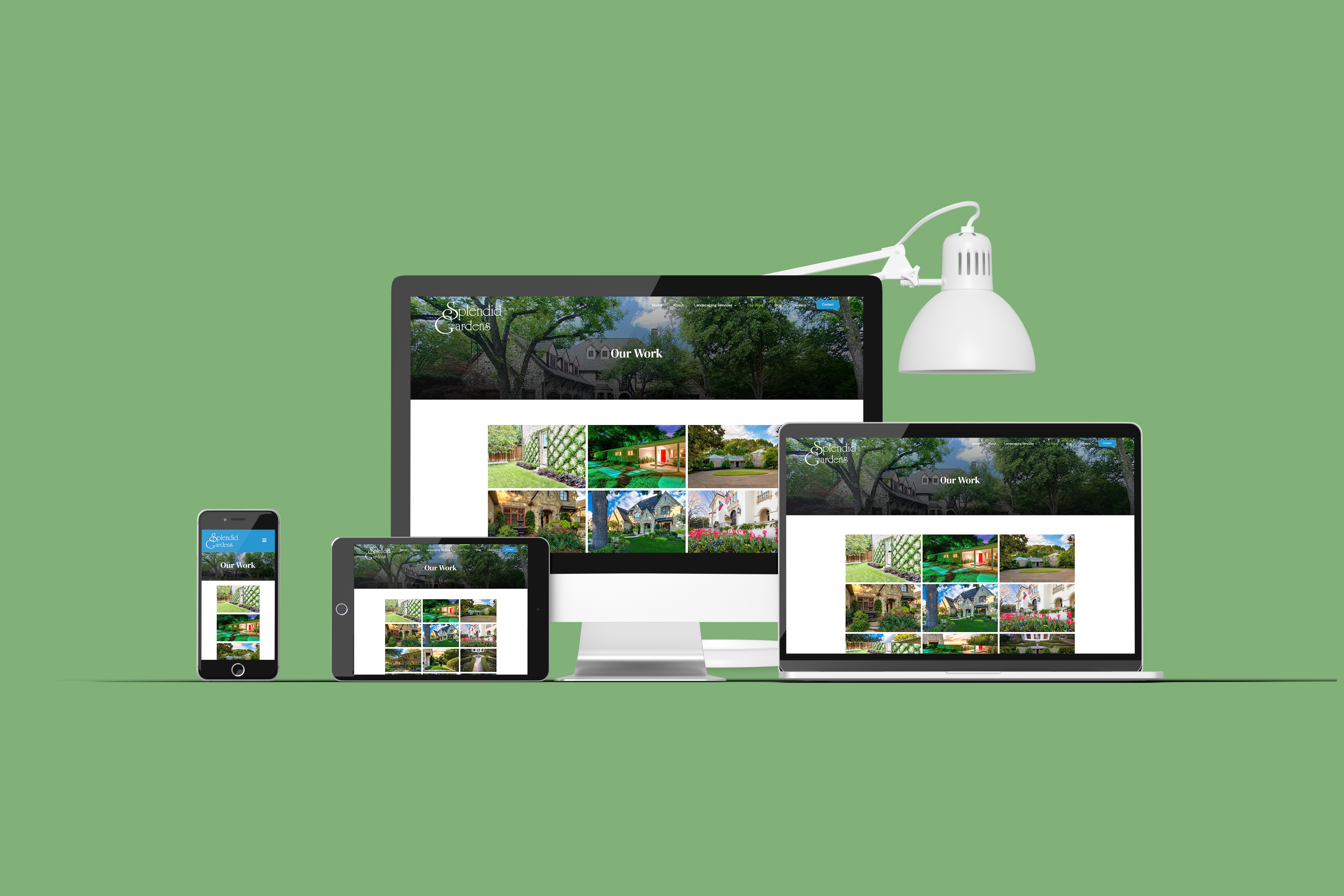
With a grid layout, it is very easy to scroll and review many images quickly. There will be images that the user wants to see in more detail. When they click on the image, it will open a “lightbox” to view a larger, zoomable version of the image.
One advantage is that customers may ask to reference these images in their own projects. Giving them access to the details is key to crafting trust with them.
5. Add a “Call to Action”
Now they know what they want, but what do they do next?
After viewing your landscape gallery and inspecting your work, the customer is most likely ready to engage. We need to make sure that it is super easy to connect.
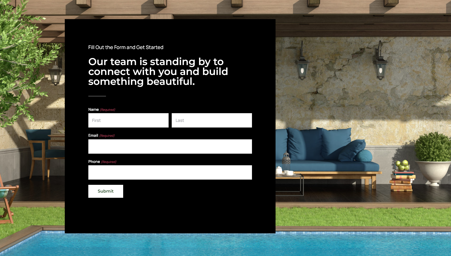
By adding a “call to action” we direct the customer on the next step. This could be a button that links to you contact page or just a contact form right there on your landscape gallery page. It can also be a direction to your office or your phone number.
Whatever the information is, include a command action with it. Some popular “call to action” command phrases are:
- Schedule Now
- Contact Us
- Request a Quote
- Call Today
- Visit Us
- Email us Directly
- Buy Now
Each of these phrases communicates what to do next. If we direct them and have built enough trust through our website, they will most likely follow the command.

Do I Really Need All This For My Gallery Page?
These 5 actions are required for your landscape gallery page to succeed on Google and other search engines.
It seems like a lot of work. Can it really be worth it? Yes. 100% these actions have the ability to drive traffic and create leads.
Once you perform this process a few times, it will become second nature. Expanding your gallery each year is key to SEO and customer interest.
If you need help creating your landscaping gallery page, or you need a website built just for landscapers, call Landscape Web Pros today. We are helping landscapers all across North America to grow their business online and start living the way they want to live.


